Visualize your data using Grafana on TagoCore
TagoCore is a free, fast, and open-source IoT platform for edge computing that can be used in association
with TagoIO to visualize your data by using several Widgets to create beautiful dashboards that can be deployed to your end-users.
However, you can also use third-parties applications like Grafana to visualize your data through simplified panels, and also to set up alerts using data from your TagoCore application, just like with TagoIO.
By the end of this tutorial, you will have enough knowledge to know the basics of querying data to create dashboards with graphs, charts, and so on.
Requirements to follow this tutorial
There are some basic settings that need to be configured before using Grafana.
- Install the latest version of TagoCore on your machine, and connect your devices. Check out the official TagoCore website for more information;
- Connect your TagoCore to a Database server. You can check out the available plugins to connect to your database by clicking on the Plugin Store button located on the TagoCore's sidebar. You can also build your own plugin by following the tutorial Creating a Plugin;
- Basic knowledge of query data using SQL language.
Make sure that you are receiving data into your TagoCore, and that it's being stored in your database.
Installing Grafana
You can choose to run Grafana local or cloud. You can compare the differences between both versions on their Official Website. Refer to the links below to get started:
Make sure you have Grafana running (cloud or local) before advancing on this tutorial.
Connecting your database
In order to visualize data, you will need to connect Grafana to a database server running local or cloud. Refer to this link to check the Supported Databases.
Follow the instructions below to connect Grafana to your database:
- Open Grafana;
- Search for the "Configuration" icon on the left sidebar;
- Go to the tab "Data Sources" and then click on the button "Add new data source";
- A list of available data sources will be displayed, select the one for you. After selecting a data source, a new screen will appear. Here you need to fill in the connection details for your data source;
- Fill in the required information to connect your data source, and then click on "Save & test" to test your connection. If all information is correct, a green alert will be displayed.
Note: If the system is throwing an error, check your data source configuration; it's recommended to run some tests to verify if it's working correctly:
- Verify the status of your database connection at TagoCore;
- Try to run some SQL queries inside your database source;
- Restart your database server, and try again.
On Grafrana, you can see a list of your data sources by clicking on the configuration button, and then the Data Sources tab.
Selecting your data to create graphs and tables
In order to show your data in a bar chart or a graph, you will need to make a query to return the desired information from your database. Queries are how Grafana panels communicate with data sources to create a visualization. Read more about Querying a Data source.
In Grafana you can write a SQL query if you want to, but you can also use the UI provided to skip the coding part, or even use both. Let's see how to get data from a device and display it in a table or a graph using only SQL queries.
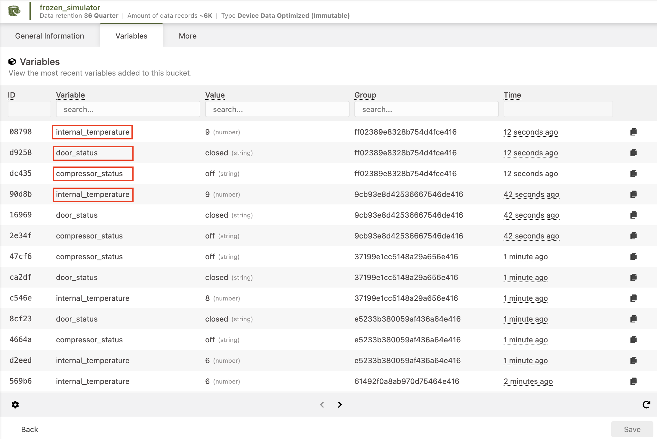
Before we continue, the data I'll be using is being generated from the "Freezer Simulator" plugin, which can be found inside TagoCore > Plugin Store.
Let's get started!
Querying data
Before creating your visualizations, it is important to query your data. In my case, my device sends the following 4 variables:
The idea is to create a visualization for each of these variables. To do this, first we need to run a simple query to remove any undesired variables. This is necessary because Grafana's visualization tool automatically plots data based on the data type of your columns and the columns you have filtered.
For example, a time series chart of temperature values willl require two types of data: a numeric value for temperature and time. To achieve this, we need to write a query that only includes the necessary columns for the visualization: variable, value, and time.
It's important to note that multiple values can be plotted in the same visualization, as long as they are queried as separate columns.
Let's see some examples.
Plotting Data
How to plot a Time Series (Line Chart)
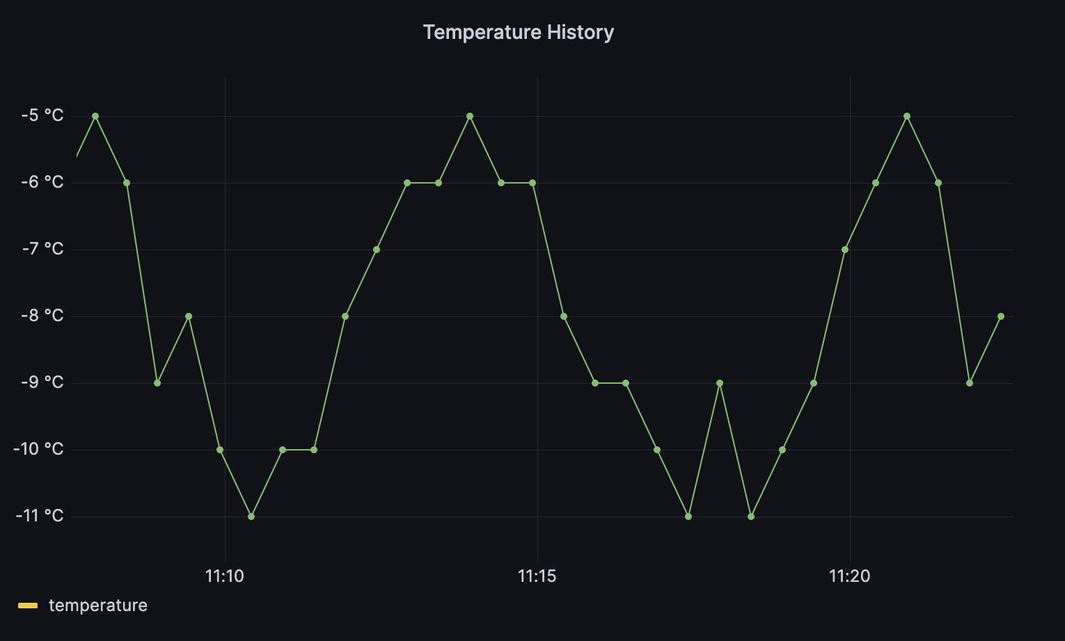
Well, let's reproduce the visualization above. The idea is to plot a time series of temperature data.
1. Open Grafana and navigate to "Dashboards" in the left sidebar. Create a new dashboard and add a new panel to it. Think of the panel as a widget in TagoIO;2. In the Edit Panel page, navigate to the "Query" tab at the bottom. Look for the "Data Source" option and select the database you connected earlier. A query will be created automatically. By default, the Query Builder will be displayed to help you filter the data from your database;3. If you plan to filter your data using SQL, you will need to use the Terminal instead of the Query Builder. To switch to Terminal mode, click on the "Code" button located in the top right-hand corner of the Query tab;To filter my data I used the following code:
- #Select the variable that contains the data I want to plot
- SELECT
- variable,
- value,
- time
- FROM tcore_device."614eca8a26118f556bf19385" AS freezer_simulator
- #Return only the data regarding the temperature information.
- WHERE variable = 'internal_temperature'
Keep in mind that you can easily switch to table view at any time by clicking the 'Table View' switch located in the top center of the screen. This allows you to quickly view the results of your query;4. You may receive an error message stating "Data is missing a number field". This occurs because your query does not include a numeric value, which is required for this type of visualization. To resolve this, use the Transform tool to convert the data type of your data.
Go to the "Transform" tab and find the "Convert Field Type" function. Define the data type of your columns as follows:
- variable: string
- value: numeric
- time: time with input format as YYYY-MM-DD HH-MM-SS
Congratulations! Your data is now plotted in real-time. Click the "Apply" button to return to your dashboard.
Additional Information
Additional Information
Note that you can customize the color, name, legend, unit, and more using the options on the right side of the screen, in the "Options" pane. For more information, refer to the Grafana documentation on Panels and visualizations.
Now that you have filtered your data, you can easily change the type of visualization by selecting various options on the right side of the screen in the Options pane. Keep in mind that some visualizations may require different data or additional configurations
Creating a table with multiple variables
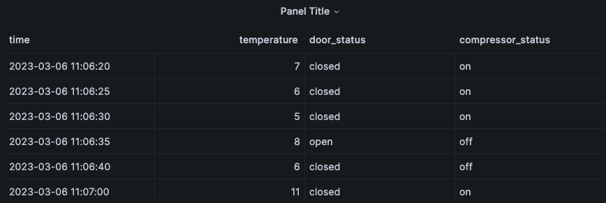
Let's create a table that displays the values for all four variables: temperature, door, and compressor. To do this, we need to filter the data for each variable and then join the three queries to make one unique table using the time information.
1. First, create a new panel, select your data source, and change the visualization to Table in the top right corner;
2. Create three queries, each one using a different filter. You can create multiple queries in the same panel by clicking on the '+ Query' button. Here are the sample queries I created:
Name: Temperature
- SELECT
- Value AS temperature,
- time
- FROM tcore_device."614eca8a26118f556bf19385" AS freezer_simulator
- WHERE variable = 'internal_temperature'
Name: Door
- SELECT
- Value AS door_status,
- time
- FROM tcore_device."614eca8a26118f556bf19385" AS freezer_simulator
- WHERE variable = door_status
Name: Compressor
- SELECT
- Value AS compressor_status,
- time
- FROM tcore_device."614eca8a26118f556bf19385" AS freezer_simulator
- WHERE variable = 'compressor_status'
Each query filter return only the values of specific variable described in the WHERE variable = <variable value>3. You will notice that three tables were created. However, as they all share the same time column, we can use it to join them into one table. Go to the Transform tab and add a new transformation called "Join by Field." Select the INNER mode and the field as 'time'.4. Voila! You now have a table that displays the values for all four variables.
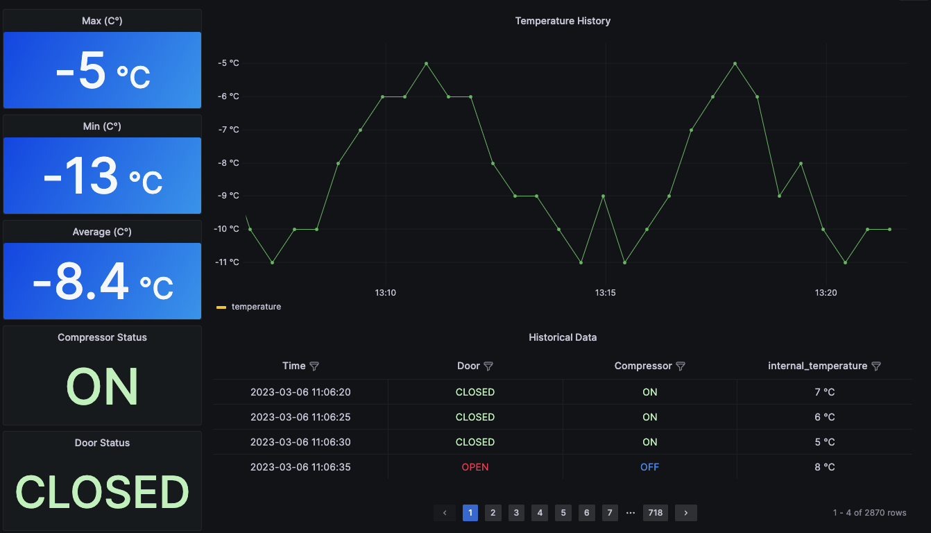
Hope you had an idea of how to use Grafana to create views to show your data, just like the Widgets on TagoIO, but with a little bit more work to prepare the data.
You can also integrate your TagoCore instance with TagoIO cloud here: TagoCore
You can also integrate your TagoCore instance with TagoIO cloud here: TagoCore
Topic Participants
Phil Gutierre
Bill Bianeck
Farhad Arvin
LoraSAC